Assignment: Design a landing page for a fictive conference
Project Overview
The assignment was to design a landing page that would serve as an informational website about an upcoming, fictional conference with the following requirements:
Maximum space: 960x600px
Screen resolution: 1024x768px
Design for a small screen without scroll
Menu system with six headlines
At least one image with optional size
Include MDU’s logo in optional size, time and place
Pre-determined main heading, preamble, puff texts and footer
My Design Process
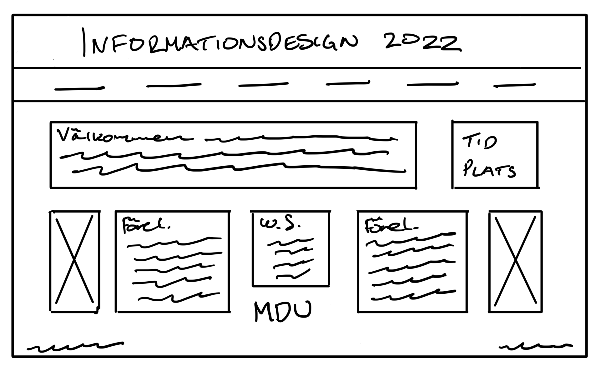
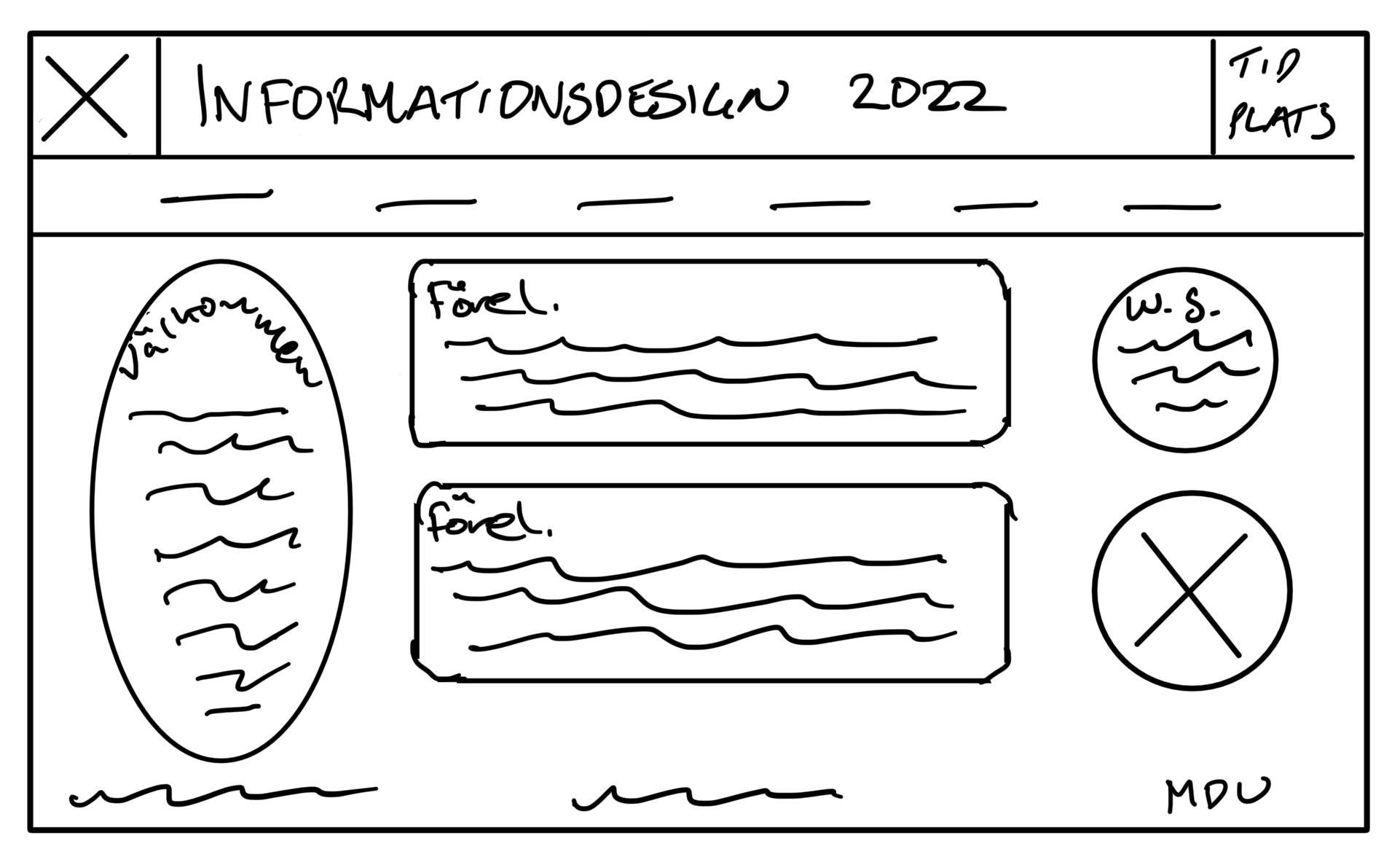
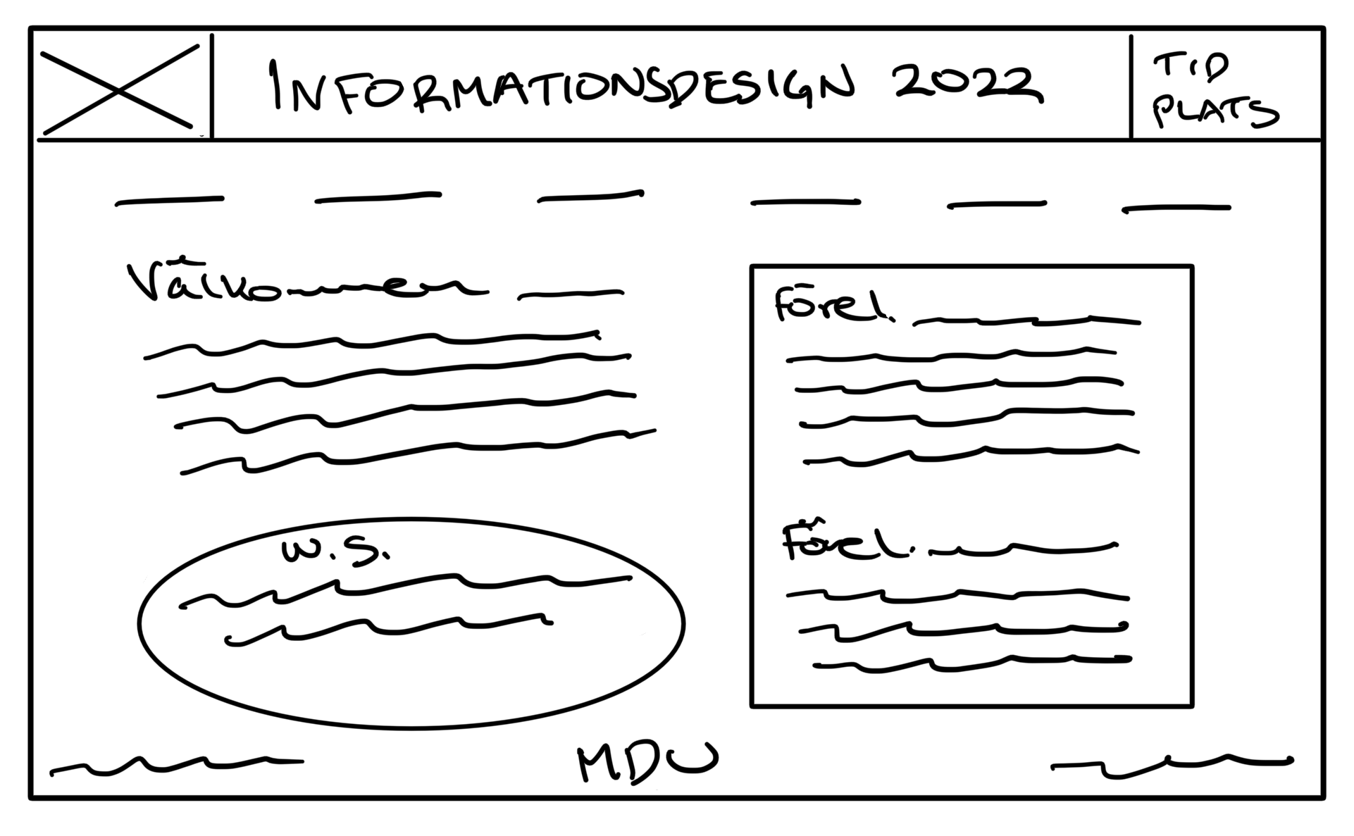
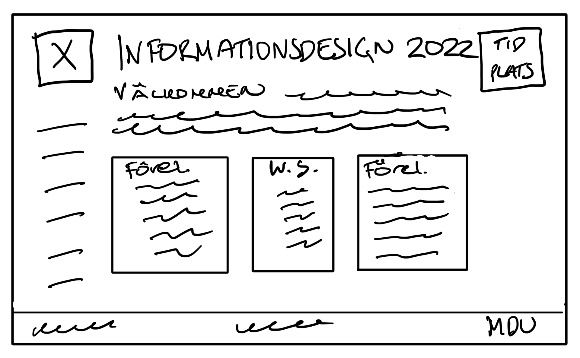
I started by quickly sketching ten ideas and discussing them with potential users.
I then created two wireframes that incorporated the most favored elements and conducted an A/B test. The preferred sketch was then developed in Webflow and after just one iteration, the final prototype was to be presented.
With the feedback that I got from the presentation, I had to “Kill my darling” and go back to creating wireframes again. With further insights from potential users, I then redesigned the landing page, characterized by a minimalistic approach and a powerful background color that makes the page stand out.
My main focus throughout this process was to achieve good readability and congeniality by employing clear typography, hierarchy and layout. All due to the informative nature of the site.
Sketching and discussing with potential users
Feedback example from viewers:
“I think this one is ok, but a little bit boxy. Do the images belong to the texts about the lecturers?”
Feedback example from viewers:
“It looks fun and playful. It feels a bit unserious maybe. I don’t know where to look first.”
Feedback example from viewers:
“I don’t know. It looks a bit messy. To many shapes for me.”
Feedback example from viewers:
“I like this one. It looks clean and I can easily find all information.”
Creating wireframes based on feedback
The conducted A/B test showed that the potential users preferred the first one.
“I like the heading. It has the most important information and I like that the menu bar sort of frames the title.”
“It’s easy to get a quick overview of the page.”
The conducted A/B test showed that the second one had more issues than the first one.
“I like the menu on the side, but I don’t like the circle. It looks off.”
“It’s ok, but it’s missing something in the header. It looks empty there.”
“The preamble seems wide.”
Presentation, feedback & iteration
During the presentation of my finished landing page proposal, I received constructive feedback that encouraged me to reassess and refine the design. Embracing the concept of “killing my darlings”, I revisited the wireframe stage and conducted another A/B test based on the new wireframes.
“I don’t like the background color, It’s too sharp and it doesn’t exactly give me a conference feeling.”
“It’s a bit boxy and I don’t get the picture. It doesn’t seem to match the topic of the conference.”
“I think it’s a little off-balanced. The image takes to much of my focus. I love the background color, but not in this context. What’s it’s relation to information design or MDU?”
“I prefer this one. It has a good flow and I like that the information boxes are separate from each other.”
“I like it, but maybe the image is a little to big compared to the texts. Otherwise I think it looks good.”
“I don’t know what it is, but something is bothering me. Maybe it’s the elongated images. I’m not sure I like that.”
“It’s ok. It’s balanced sideways, but I think that the Workshops text feels cramped.“
Final design proposal
Final reflections
Since the landing page needed to be completed within two weeks, a significant amount of time was dedicated to learning the Webflow program. Despite the tight timeframe, I managed to conduct small and simple tests with potential users during the design process, providing me with valuable insights.
Taking the feedback into consideration, I had to redesign the landing page. This resulted in a more balanced layout, better aligning with the messaging the site aims to convey.


